|
SST/macro
|
Spyplots visualize communication matrices, showing either the number of messages or number of bytes sent between two network endpoints. They are essentially contour diagrams, where instead of a continuous function $F(x,y)$ we are plotting the communication matrix $M(i,j)$. An example spyplot is shown for a simple application that only executes an MPI_Allreduce (Figure 16). Larger amounts of data (red) are sent to nearest neighbors while decreasing amounts (blue) are sent to MPI ranks further away.
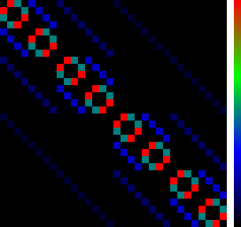
Figure 16: Spyplot of Bytes Transferred Between MPI Ranks for MPI_Allreduce
Various spyplots can be activated by boolean parameters in the input file. The most commonly used are the MPI spyplots, for which you must add
After running there will be a .png file in the folder
mpi_spyplot_bytes.png shows the number of bytes exchanged between MPI ranks. To extend the analysis you can specify
A new png will appear showing the number of bytes exchanged between physical nodes, accumulating together all MPI ranks sharing the same node. This gives a better sense of spatial locality when many MPI ranks are on the same node.
 1.8.11

